Module 5: Diffusion Univariate Statistical Testing
White matter changes through development may be indicative of maturation of structural connections between brain regions. Diffusion imaging can measure white matter trajectory and density. Therefore, we can examine the maturation of structural connections by analyzing the developmental trajectory of diffusion imaging measures. Unfortunately, diffusion datasets are quite large, and computer systems may lack sufficient RAM and CPU resources to model across the whole brain.
Here, users will learn how to use HDF5 outputs from the QSIRecon pipeline to load only the data needed for analysis, which minimizes the resource footprint and makes such analysis more accessible. We will use the Return to Origin Probability (RTOP) metric, which measures the probability that a water molecule returns to its starting point. Low in unrestricted diffusion (large cells), high in restricted diffusion (small or impermeable cells). Inversely related to pore volume.
Source Data for Tutorial
Note that for this tutorial, we will be using a phenotype file used specifically for Cieslak et al. 2025, made available via a secure NIST SP 1800 system. This tutorial will be updated in the future to use tabulated HBCD Study data available via the NBDC Data Access Platform for consistency. See the diffusion MRI documentation in the HBCD Data Release Docs site for an overview of various metrics output by QSIRecon included in this file.
Module Objectives
- Users will learn how to use diffusion imaging outputs from the ABCD study.
- Users will learn how to load HDF5 data and develop models using the ModelArray package.
- Users will learn how to use R to perform statistical analysis of variance.
Walkthrough
-
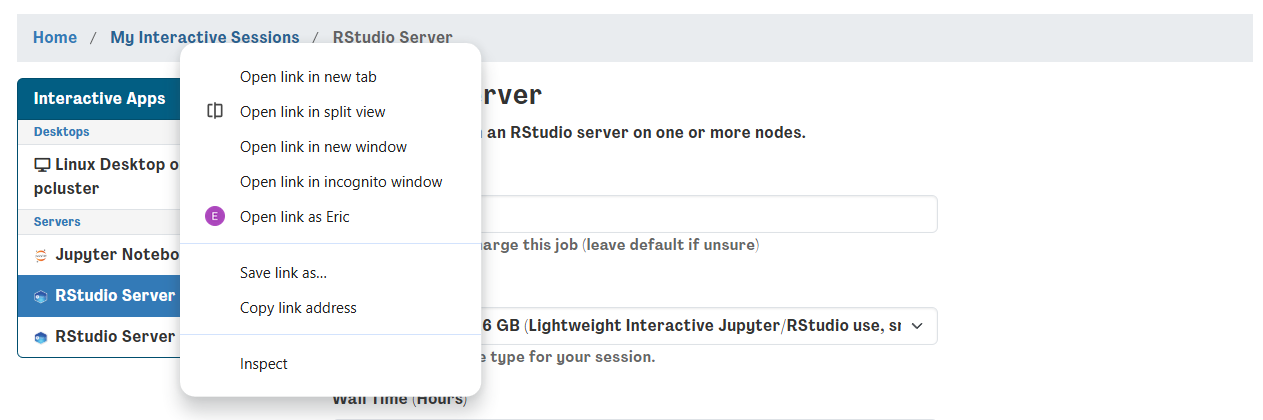
Return to your interactive sessions, you can do this by clicking on a new session in the dashboard and opening a new window. Instead of launching, click on the “My Interactive Sessions” highlighted in blue – it will open the link to your sessions page.
-
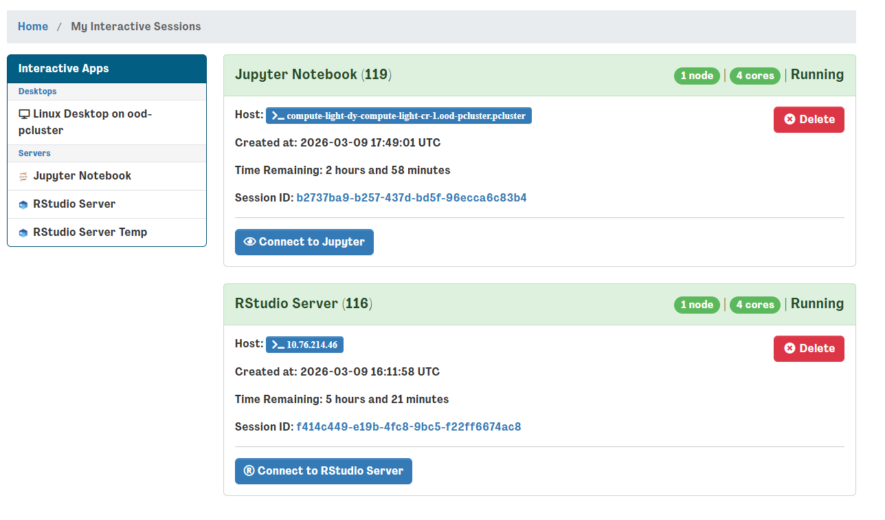
From your sessions, select your R studio server and launch it – if it's already open, you can skip these steps. Don't worry if you accidentally relaunch, r studio servers are saved as images and are restored between sessions.
-
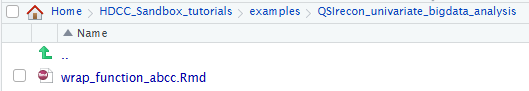
Selecting the R studio server, navigate to the
qsiprep_bigdata_univariate_analysisfolder and open the corresponding R markdown (“.Rmd”) file.
-
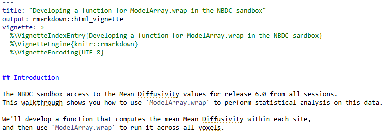
This will open the R markdown file in the top left corner – the file can be “knitted” into an html output. For the HDCC tutorial, we will run through the steps instead.
Code Highlights
The markdown file contains a complete example from start to finish for using modelarray to perform a brain-wide association analysis. Researchers can modify the file to answer your questions your way! Here we highlight a few simple snippets that can be easily customized.
Selecting the data to load
You can choose the imaging data for your question by changing the h5_path to your preferred h5 file. You can also change the imaging measure loaded from the h5 file by changing scalar_types in the code block at the beginning of the file, reprinted below.
# Use the real path
h5_path <- "/shared/hackathon/working-area/hbcd-workshop/mapmri-rtop/mapmri_rtop.h5"
# create a ModelArray-class object:
rhdf5::h5ls(h5_path)
modelarray <- ModelArray(h5_path, scalar_types = c("mapmri_rtop"))
# let's check what's in it:
modelarray
To choose different behavioral or developmental measures for answering your questions, you will need to select a different csv file. To do this, change the csv_path under the code chunk titled load csv file. The code from the ipython notebook is reprinted below.
csv_path <- "/shared/hackathon/working-area/hbcd-workshop/mapmri-rtop/mapmri_rtop.csv"
# load the CSV file:
phenotypes <- read.csv(csv_path)
nrow(phenotypes)
names(phenotypes)
Exploring the Data
With both modelarray and data frame phenotypes set up, we can explore the data and prepare to write a function that we can use within ModelArray.wrap to compute what we want. It can be tricky to figure out exactly what you want to compute and how to make sure your function returns the correct output. We can use a convenience function from ModelArray to see what a dataframe looks like for a single voxel.
{r check_one_element_df, eval=FALSE}
example_df <- exampleElementData(modelarray,
    scalar = "mapmri_rtop",
    i_element = 72110,
    phenotypes = phenotypes)
names(example_df)
This is a rich dataframe! It contains the Mean Diffusivity for all subjects in the study at voxel 72110. It also contains the subject ID, session ID, sex, age, and other covariates.
We can explore this single voxel like we would any dataframe - continue on to next section.
Making Bar plot visualizations
Bar plot visualizations are effective ways of visualizing a single comparison. The code chunk below is reprinted from the ipython notebook and can be easily customized to fit your preferences. Change x from session_id to plot a different variable on the X axis. Change y to plot a different variable on the Y axis. Change color from session_id to color-code the bars by a different grouping variable.
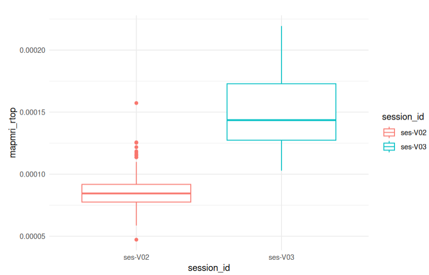
library(ggplot2)
ggplot(example_df, aes(x = session_id, y = mapmri_rtop, color = session_id)) +
  geom_boxplot() +
  theme_minimal()
Choosing your model and data to analyze
Modelarray uses a wrap function to perform data analyses. A code chunk for running a single Modelarray comparison is reprinted below. Change 72110 to select a different imaging datapoint to analyze. Change mampri_rtop to the imaging datatype one wants to analyze. Change my_mean_mapmri_rtop_fun to select a different model for analyzing the data. Change phenotypes for selecting the non-imaging data to analyze.
analyseOneElement.wrap(
  72110,
  my_mean_mapmri_rtop_fun,
  modelarray,
  phenotypes,
  "mapmri_rtop",
  num.subj.lthr = 2,
  flag_initiate = TRUE,
  on_error = "debug"
)
More Examples
More examples can be found in the model array additional notes.
Brain-based Visualizations
Introduction
Mass-univariate brain-wide association studies (BWAS) help discover new biomarkers associated with mental health, such as development or cognitive outcomes. Visual inspection of these analyses on the brain remains extremely helpful in understanding and communicating findings to the broader scientific community. Here, ModelArray was used to examine the effects of age on variation in myelination as measured by RTOP. The ipython notebook, from start to finish, was used to conduct a whole-brain diffusion analyses to examine the effect of development on myelination patterns across the brain. The following section will take you through one way to view these outputs on a template brain using wb_view
- First, we will return to the virtual desktop by selecting the active virtual desktop session.
- We will then open a terminal. If you already have a terminal open feel free to use it.
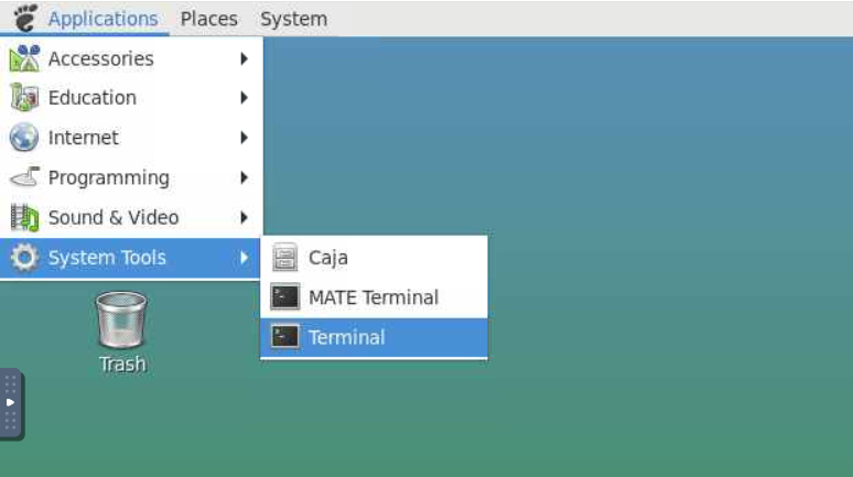
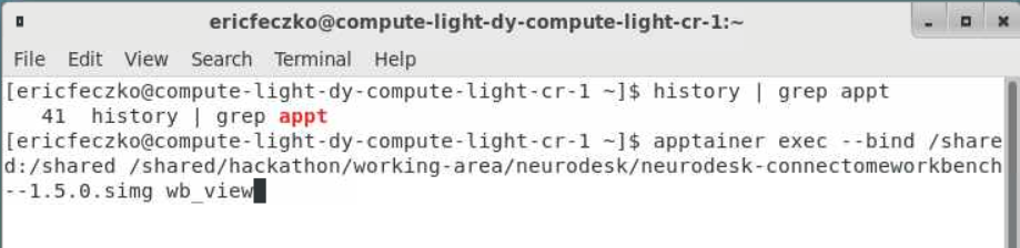
- From the terminal we will open
workbench_viewthis is an apptainer that can be accessed using the following command:apptainer exec --bind /shared:/shared /shared/hackathon/working-area/neurodesk/neurodesk-connectomeworkbench--1.5.0.simg wb_view
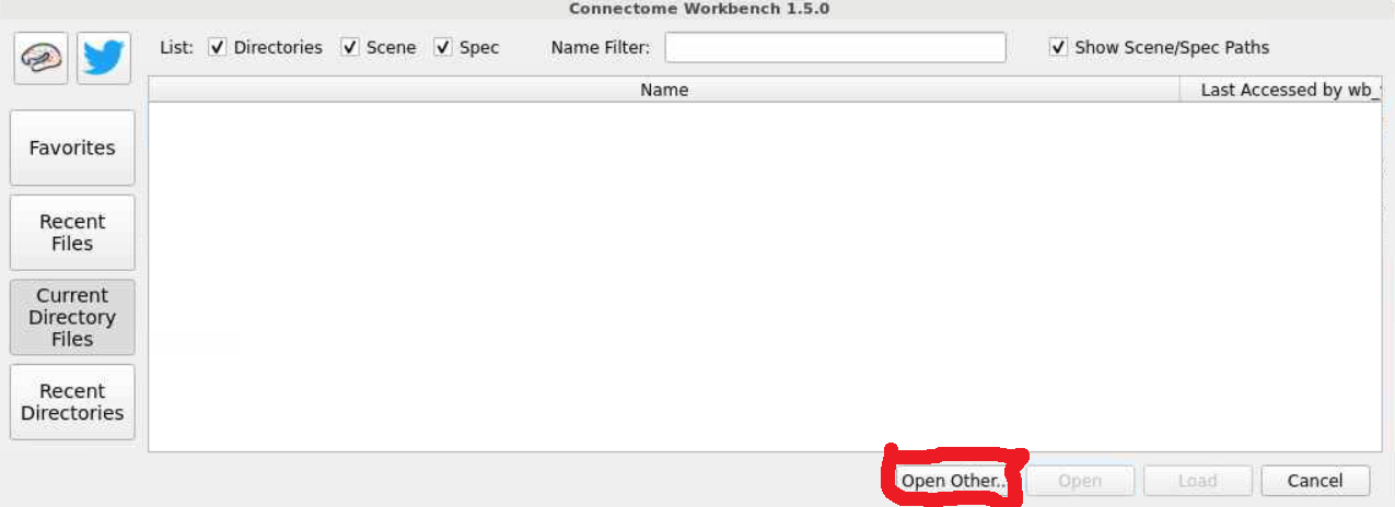
- This will open a workbench view window where we can open files. The left hand tab allows users to navigate to recently used files or their home directory. For now select the
open otherbutton on the lower-right-hand side.
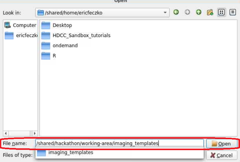
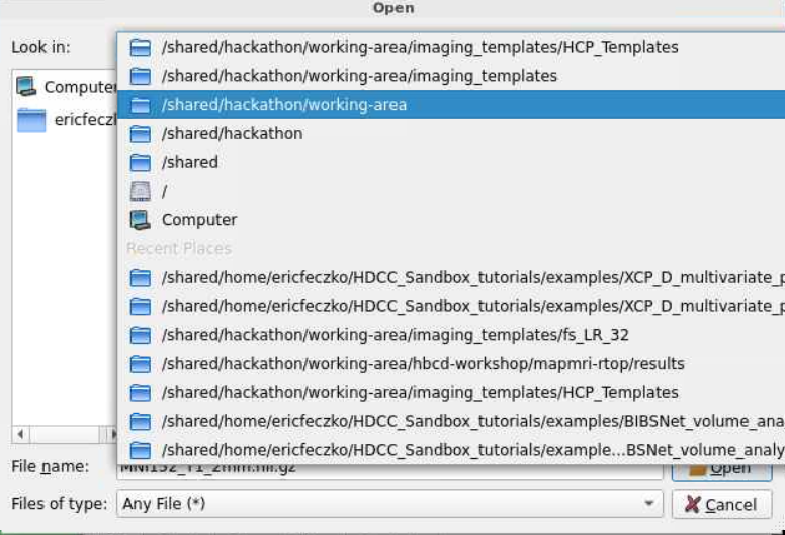
- For this module, we will use HCP volumetric templates. The HCP templates can be found within
/shared/hackathon/working-area/imaging_templates/HCP_Templates/. Follow the pictures below to locate the final path to the HCP template folder.
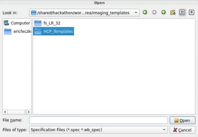
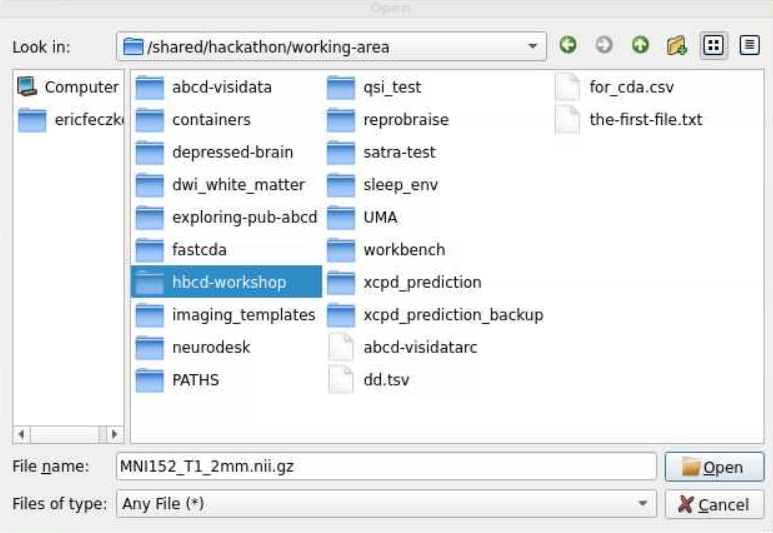
- With many templates to choose from, we need to choose the right template with the same dimensions as our statistical maps. Here we will select the
MNI152_T1_2mm.nii.gzfile, as it matches the diffusion outputs here.
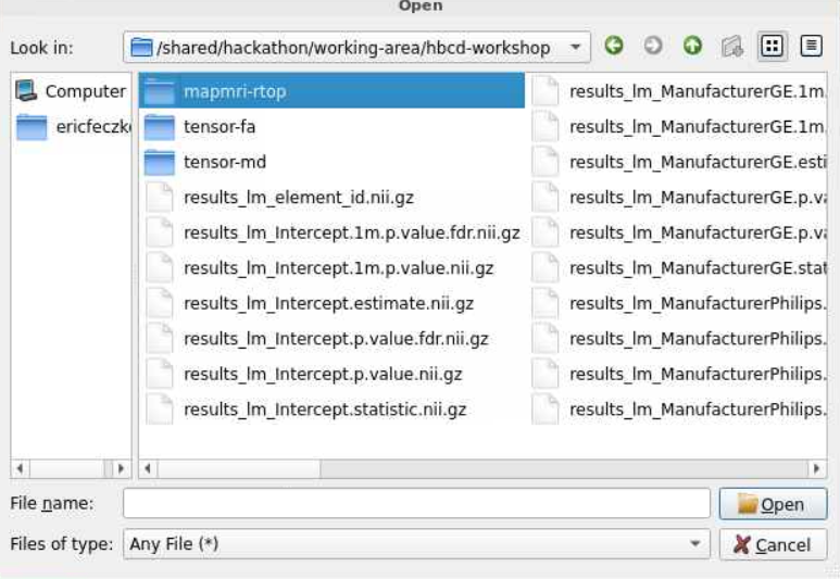
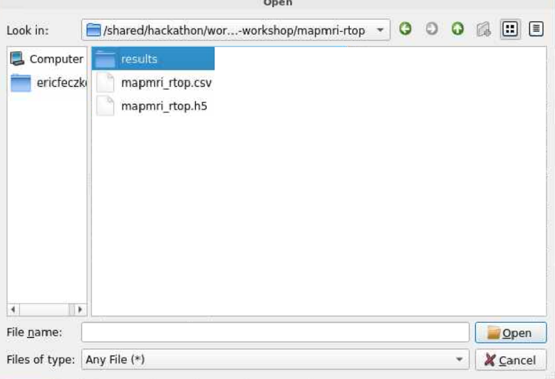
- Next we will need to load our statistical data. Return to the
/shared/hackathon/working-area/and navigate tohbcd-workshop
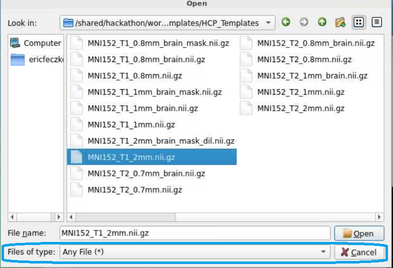
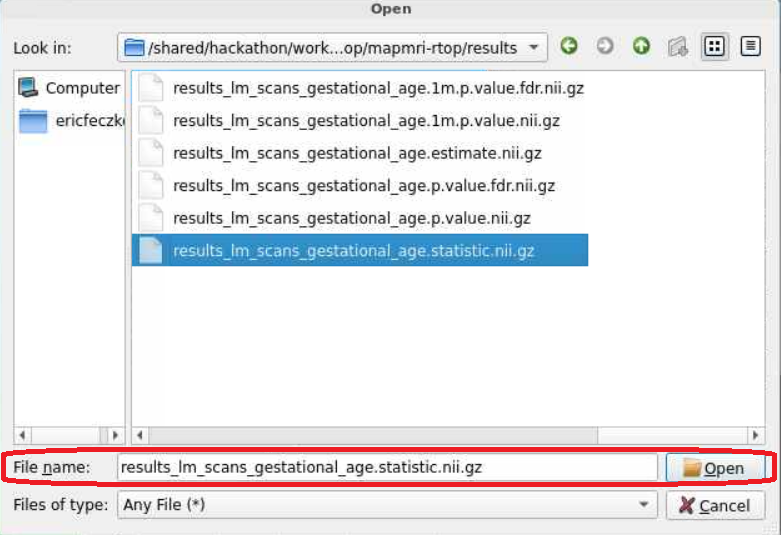
- There is a lot of that we can visualize here! Lets navigate to the
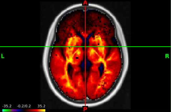
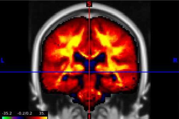
mapmri-rtopfolder and then theresultssubfolder within. To visualize the effect of age we will load theresults_lm_scans_gestational_age.statistic.nii.gzfile.
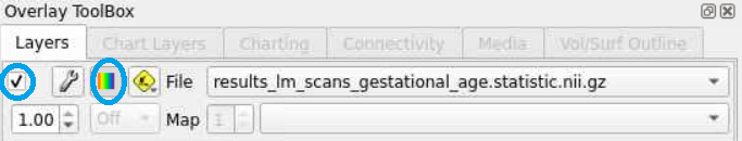
- There will still be an empty brain in the brain based visualization. To display the statistical map, lets select the top layer in the
overlay toolboxselecting the radio button all the way on the left (red circle), and displaying the color bar (blue circle). We can now see the test statistics on the brain!
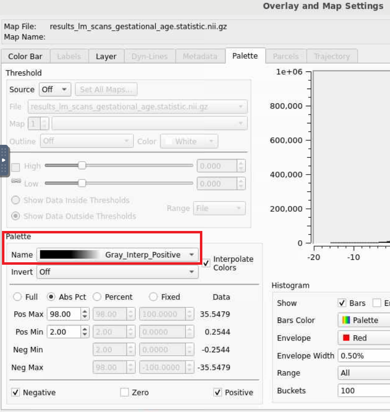
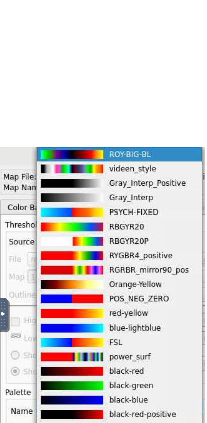
- This statistical map is currently in greyscale. If we select the wrench button (red circle), we open an editor window that allows us to manipulate the map any way we want. Selecting the
Nameunderneath thePalettesection opens a lot of options, lets select the top optionROY-BIG-BLfor this example. Then close the editor window.

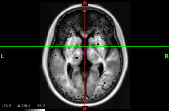
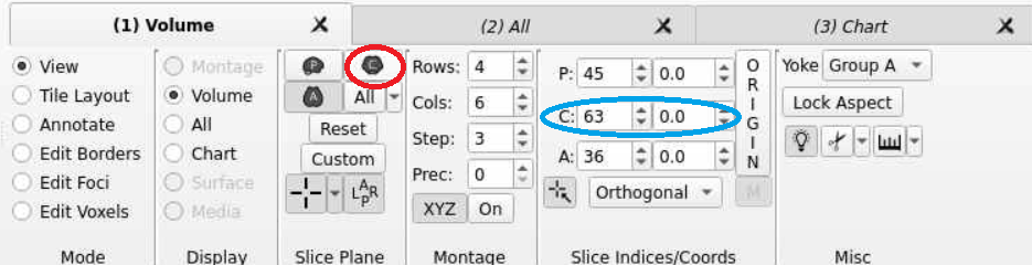
- Now we can navigate the brain and examine the statistical output for different structures! If we want to change the view or slice we can use the tools under the volume tab. We can select the orientation, such as coronal (red circle), to change our perspective. We can navigate different slices using the slice window (blue circle) for the corresponding orientation.
Conclusion
White matter development varies considerably throughout the brain. Typically, modelling these trajectories in the context of developmental outcomes requires vast computing resources. The Modelarray package and hdf5 file formats greatly minimize memory usage, enabling you to answer your brain-behavior questions on the same resources as a laptop. In addition, the example here shows you how to produce brain-based visualizations so you can further understand and commmunicate your findings.
Next Steps
The next section XCP-D Output Multivariate Prediction will show how to perform multivariate prediction analysis using XCP-D derivative outputs for functional connectivity.